
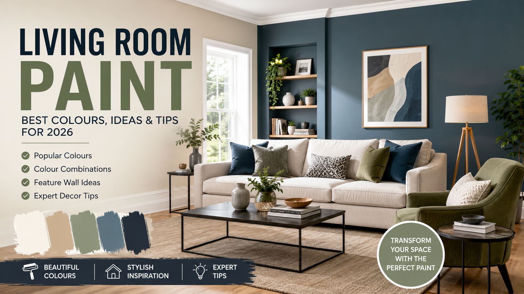

Choosing the right living room paint can completely change the appearance and atmosphere of your home. A fresh coat of paint can make a small room feel brighter, give a large room a warmer and more comfortable character, or create a stylish backdrop for furniture and artwork.
The challenge is that there are almost endless colours, finishes and combinations to choose from. A shade that looks beautiful in a paint shop may appear completely different once it is on your living room walls because natural light, artificial lighting, furniture and flooring can all influence how a colour looks.
Whether you prefer timeless neutrals, calming greens, sophisticated blues, warm creams or dramatic darker shades, there is a living room paint colour to suit almost every style.
This guide explores the best living room paint ideas, how to choose colours based on natural light, which finishes work well, how to coordinate paint with furniture and some of the decorating techniques you can try in your own home.
Why Living Room Paint Matters
The living room is often one of the most frequently used areas of a home. It may be where you relax after work, watch television, read, entertain friends or spend time with family.
Because the room serves so many purposes, the wall colour can have a significant effect on how the space feels.
A soft neutral can create a calm and flexible background. Green and blue can bring a relaxing, nature-inspired quality, while warmer colours such as yellow, terracotta and orange can make a room feel more welcoming.
Paint can also change how you perceive the size and proportions of a room.
Lighter shades can help a space feel open and airy, while darker colours can create a more intimate and cosy atmosphere. Dulux similarly recommends considering whether you want a neutral or colourful living room before deciding on a scheme.
How to Choose the Best Living Room Paint Colour
There is no single “best” colour for every living room. The right shade depends on several factors.
Before buying several tins of paint, think about:
- How much natural light the room receives
- Which direction the room faces
- The size of the room
- Your existing furniture
- Flooring and curtains
- The atmosphere you want to create
- Whether you want a timeless or dramatic look
- The type of paint finish required
Taking these factors into account can make the final result much more successful.
1. Warm White and Cream Living Room Paint
White is one of the most popular choices for living rooms because it creates a clean and bright appearance.
However, pure white can sometimes feel quite stark, particularly in rooms with limited natural light. Warm whites and creamy shades can provide a softer alternative.
Cream works particularly well if you want a traditional, comfortable or slightly rustic interior. It can also be combined with natural wood, beige furniture and warm lighting.
Why choose cream?
Cream and warm white can:
- Make the room feel brighter
- Create a relaxed atmosphere
- Work with traditional furniture
- Complement wooden floors
- Provide a flexible backdrop
- Make accessories easier to change
If you frequently change cushions, artwork or curtains, a neutral wall can give you more freedom.
2. Grey Living Room Paint
Grey has become a popular choice for modern interiors because it can range from extremely pale shades to deep charcoal.
A soft grey can provide a subtle alternative to white, while charcoal can create a dramatic feature wall.
Grey is also versatile because it can be combined with many other colours.
For example, grey can work with:
- White
- Cream
- Navy
- Green
- Pink
- Yellow
- Natural wood
- Black
Dulux describes grey as a timeless and versatile living room option, with both soft grey and charcoal offering different design possibilities.
Warm grey vs cool grey
This distinction is important.
Warm grey contains subtle beige, brown or red undertones, while cool grey can have blue or violet undertones.
If your sofa and flooring have warm tones, a warm grey may create a more harmonious appearance. If your furniture has cooler colours, a cool grey may work better.
3. Green Living Room Paint
Green is an excellent option if you want your living room to feel connected to nature.
There are many variations, from pale sage and soft olive to rich forest green.
Sage green
Sage is relatively subtle and can work well if you want to introduce colour without making the room feel overwhelming.
It pairs nicely with:
- Cream
- White
- Light wood
- Natural fabrics
- Beige
- Soft grey
Forest green
Deep green creates a much more dramatic effect.
It can work particularly well in rooms with plenty of natural light, although darker green can also create a cosy atmosphere in smaller spaces.
Green is frequently recommended as a calming alternative to traditional neutrals. Dulux’s living room guidance includes shades ranging from lighter sage-style colours to darker forest greens.
4. Blue Living Room Paint
Blue is another highly flexible option.
A pale blue can make a room feel fresh and airy, while navy can create a sophisticated and dramatic interior.
Light blue works particularly well with white and natural wood. Navy can be combined with cream, grey, brass details and warm lighting.
For 2026, Dulux has highlighted several blue-based living room colour approaches, including combinations built around indigo-inspired shades.
Navy blue
Navy can be especially effective as:
- A feature wall
- A backdrop for artwork
- A colour behind a sofa
- Part of a blue-and-grey scheme
- A dramatic colour-drenched interior
If you are worried that navy will make the room too dark, balance it with lighter furniture, mirrors and warm lighting.
5. Beige and Taupe Living Room Paint
Beige and taupe have returned strongly as popular neutral choices because they can make a room feel warmer than some cooler greys.
These colours are particularly useful if you want a comfortable and timeless living room.
A beige wall can work with:
- Brown sofas
- Cream furniture
- Wooden floors
- Rattan accessories
- Green plants
- Natural textiles
Taupe can be especially useful when you want something more sophisticated than basic beige while still maintaining a neutral palette.
Modern neutral schemes can combine beige, cream, grey and taupe in different proportions to create a layered look rather than relying on one flat colour.
6. Pink Living Room Paint
Pink does not have to mean an overly bright or traditionally feminine interior.
Soft blush, dusty rose and muted pink can create a sophisticated living room when combined with the right colours.
For example, soft pink can work with:
- Grey
- Cream
- Dark green
- Navy
- Natural wood
- Brass
A muted pink can also be used on all four walls, while brighter pink can be restricted to an accent wall or decorative details.
7. Yellow Living Room Paint
Yellow can bring energy and warmth into a living room.
If you want a cheerful atmosphere, a sunny yellow can make a strong statement. For something more subtle, choose a muted mustard, pale yellow or warm golden tone.
Yellow can work especially well with neutral furniture.
For example, a soft yellow wall paired with cream furniture can create a welcoming environment, while mustard accents can add depth to a neutral room.
Dulux’s current living room guidance includes both bold and softer yellow approaches, with neutral furniture recommended as a way of balancing stronger yellow tones.
8. Terracotta and Warm Earthy Colours
Terracotta is a great choice if you want your living room to feel warm, earthy and inviting.
It works particularly well with natural materials such as:
- Wood
- Wicker
- Rattan
- Linen
- Leather
- Stone
You can use terracotta on all walls for a strong design or use it as a feature colour against a neutral background.
Warm reds and terracotta tones can create an especially welcoming atmosphere in the evening when combined with soft artificial lighting.
How Natural Light Affects Living Room Paint
One of the biggest mistakes people make when selecting paint is judging a colour under shop lighting and assuming it will look exactly the same at home.
Natural light can significantly alter the appearance of a colour. The direction a room faces, the time of day and the type of artificial lighting can all influence how paint looks.
North Facing Living Rooms
North-facing rooms generally receive cooler natural light.
Warm colours can help compensate for that cooler feeling.
Consider:
- Cream
- Warm beige
- Taupe
- Soft pink
- Warm white
- Terracotta
If your north facing room already feels cold, extremely cool greys and blue-toned whites may exaggerate that effect.
South Facing Living Rooms
South-facing rooms typically receive stronger and warmer natural light.
This gives you more flexibility.
Cooler colours such as blue, green and violet can help balance the warmth of the sunlight.
You can also use warmer colours if you want an especially cosy interior.
East Facing Rooms
East-facing rooms tend to receive stronger morning light.
A colour may look brighter and warmer earlier in the day and change later as the natural light decreases.
If you primarily use the room in the morning, test your paint colour at that time.
West Facing Rooms
West-facing rooms receive stronger afternoon and evening light.
Warm colours may appear even warmer later in the day, so test your chosen shade during the hours when you normally use the room.
Choosing Paint Based on Room Size
Paint cannot physically increase the size of your living room, but colour can influence how spacious the room appears.
Small Living Rooms
For smaller rooms, consider:
- Soft white
- Cream
- Pale beige
- Light grey
- Soft blue
- Pale green
Lighter shades can reflect more light and create an airy impression.
However, this does not mean that dark colours are forbidden in small rooms.
A dark feature wall can add depth and personality when balanced with suitable lighting and furniture.
Large Living Rooms
Large living rooms give you more freedom.
You can experiment with:
- Deep green
- Navy
- Charcoal
- Terracotta
- Warm brown
- Rich blue
- Dramatic feature walls
A darker shade can make a large room feel more intimate and comfortable.
Feature Wall Ideas for a Living Room
If painting every wall a bold colour feels too risky, a feature wall can be a good compromise.
Choose one wall and give it a stronger colour while keeping the remaining walls neutral.
Popular feature-wall locations include:
- Behind the sofa
- Behind the television
- Around a fireplace
- A wall with architectural details
- The wall directly opposite the main entrance
For example, you could combine pale grey walls with a deep green feature wall.
Another option is a cream room with a navy feature wall.
Should You Paint the Ceiling?
The ceiling is often automatically painted white, but it does not have to be.
One increasingly popular approach is colour drenching, where walls, ceiling, trim and other architectural elements are painted in the same colour or related tones.
This can create a more cohesive and immersive interior. Dulux describes colour drenching as a way of enveloping a room in one shade and notes that the technique can work with both dark and light colours.
For a subtle version, choose a pale neutral.
For a dramatic result, consider:
- Deep navy
- Forest green
- Charcoal
- Rich red
- Dark teal
If you are nervous about painting the ceiling a strong colour, start with a lighter shade.
Choosing the Right Paint Finish
Colour is only part of the decision. You also need to consider the paint finish.
For living room walls, matt finishes are popular because they can provide a soft appearance and help disguise minor surface imperfections.
Some washable or low-sheen options may be useful in busy family rooms where walls are more likely to need cleaning. Dulux recommends considering the location and required performance when selecting a paint type and notes that matt and satin options can be suitable for walls and ceilings, while different finishes are commonly used for woodwork.
Before buying paint, check the manufacturer’s instructions for the specific product.
How to Match Living Room Paint With Your Sofa
Your sofa is often one of the largest visual elements in the living room, so it should influence your wall colour.
Instead of choosing paint first and trying to make everything else fit later, consider the colours and undertones already present in your furniture.
For example:
Grey Sofa
Grey sofas can work with:
- Blue
- Green
- Warm beige
- White
- Pink
- Yellow
Brown Sofa
Brown furniture generally works well with warm neutrals, creams and earthy shades.
Green Sofa
A green sofa can look excellent against warm white, soft pink, cream or deeper blue depending on the style you want.
The key is to consider undertones rather than simply matching colours. Dulux recommends identifying whether the sofa fabric has warm, cool or neutral undertones before choosing complementary paint.
Living Room Paint Mistakes to Avoid
Choosing a colour is exciting, but several common mistakes can make decorating more difficult.
Choosing a Colour Without Testing It
Always test your chosen colour before committing to painting the entire room.
Paint a sample area or use sample boards and observe it at different times of day.
Ignoring Artificial Lighting
A colour can look different under warm bulbs compared with daylight.
Check your sample in the evening as well as during daylight.
Picking a Colour Only Because It Is Trending
Trends can provide inspiration, but your living room should suit your personality and lifestyle.
A colour you love is often a better long-term choice than one that is fashionable for a single season.
Forgetting Existing Furniture
Your sofa, curtains, flooring and artwork are already part of the colour scheme.
Take them into consideration before buying paint.
Using Too Many Colours
A room can quickly become visually busy if every wall, piece of furniture and accessory has a different strong colour.
If you are using bold shades, keeping the overall palette controlled can help.
How to Test Living Room Paint Before Decorating
Testing is one of the easiest ways to avoid an expensive mistake.
Start by choosing two or three potential colours.
Paint samples on large pieces of card or sample boards and position them around the room.
Look at them:
- In the morning
- Around midday
- In the afternoon
- At night
- Under artificial lighting
- Next to your sofa
- Near your flooring
- Beside your curtains
A colour that looks perfect at noon may feel completely different in the evening.
Digital colour visualisers can also help you experiment before purchasing paint. Dulux, for example, provides a Visualizer tool intended to help users preview colours in their spaces.
Living Room Paint Ideas for 2026
If you are decorating in 2026, there are plenty of directions you can explore.
Blue continues to offer considerable flexibility, particularly through tonal schemes using multiple shades of blue. Dulux’s 2026 colour guidance highlights blue palettes designed to create different moods, from energetic and creative spaces to calmer, more restful interiors.
Other strong directions include:
- Warm neutrals
- Sage green
- Deep forest green
- Navy blue
- Soft cream
- Earthy terracotta
- Muted pink
- Charcoal
- Colour-drenched rooms
- Two-tone colour schemes
The most important trend, however, is choosing a scheme that works for your actual home.
Final Thoughts
Choosing the right living room paint can be one of the easiest ways to transform your home without replacing all your furniture.
There is no universal perfect colour. The best choice depends on your room’s natural light, size, furniture, flooring and the atmosphere you want to create.
If you prefer a timeless look, warm white, cream, beige, taupe or soft grey can provide a flexible foundation. If you want more personality, consider green, blue, yellow, pink or terracotta. For a dramatic interior, deep navy, forest green or charcoal can create a sophisticated atmosphere.
Remember to test your chosen colour before painting the entire room. Observe it in natural and artificial light, compare it with your furniture and consider how you want the room to feel throughout the day.
Most importantly, don’t feel restricted by decorating rules. Your living room is a space you use every day, so choose colours that make you feel comfortable and happy.
With thoughtful colour selection, the right finish and a little preparation, a simple change of living room paint can give your space an entirely new personality.
for more information click here